Brand Identity Design | 2026
Rainboba
Case Study
Rainboba is a canned boba tea brand designed for people who don't necessarily see themselves as boba drinkers. The project explores how research-driven positioning can shape an identity that feels distinct without feeling different for the sake of it.
Read more
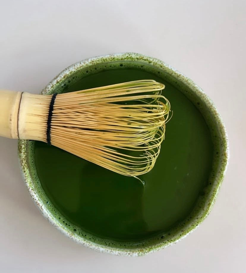
The brand
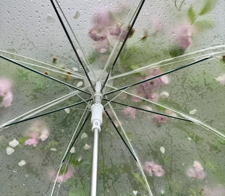
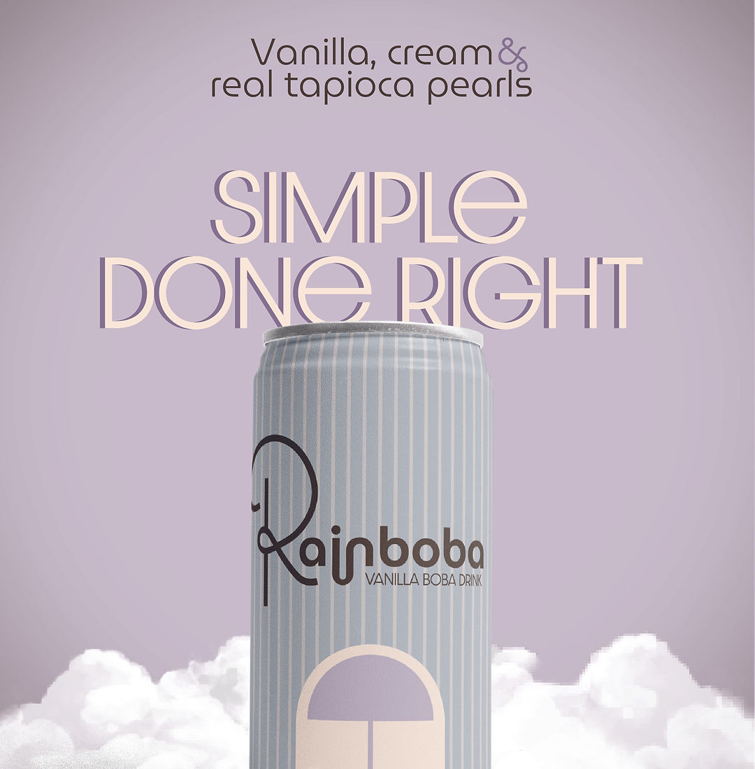
Rainboba is not your average canned-boba company — being based in the Seattle, it was clear from the start that the rainy atmosphere would be a pivotal part in designing this brand. The goal of the project was to combine that visual element with packaging and a product built around a casual consumer; someone who might reach for a can of boba the same way they would a cold brew or sparkling water.
The opportunity
Canned boba has a highly recognizable visual language: pastel colors, kawaii-inspired illustration, and packaging designed primarily for existing boba drinkers. That left an opportunity to reach a broader consumer — someone who is on the go, ingredient-conscious, environmentally aware, and interested in trying boba without being loyal to the category.
The challenge was to make Rainboba feel approachable to that audience while still communicating what makes it boba. The can format also offered a more recyclable alternative to the single-use plastic cups typically associated with boba, reinforcing the brand's fit with its Seattle audience.
Building the identity
Every visual decision was built around the same three considerations: the PNW, the product, and the person buying it. The result is a system that deliberately steps outside typical boba conventions while remaining recognizable as a beverage brand.
a distinctly pnw mark
The V3 logo was rebuilt around a wave forming the capital S in the wordmark, making Shebrews’ coastal identity part of the mark itself. The palette — Espresso, Oasis, Sea Salt, Tangerine, and Sand — was inspired by the specific colors of a West Coast coastal environment rather than chosen simply for cohesion.
a restrained color system
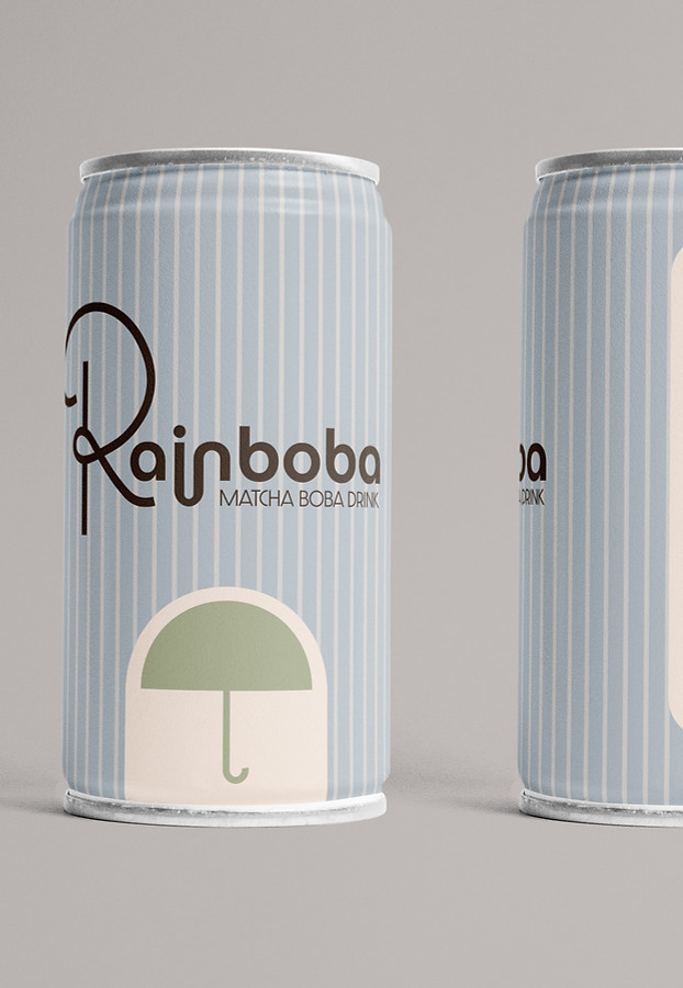
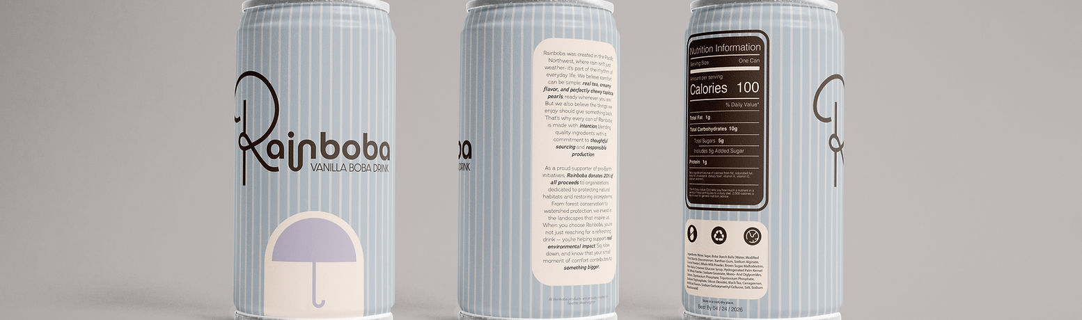
A soft grey-blue, warm cream, and deep brown form the core palette, referencing Seattle's overcast skies while keeping the identity warm and approachable. Each flavor introduces its own accent — lavender for vanilla, sage for matcha, and warm brown for brown sugar — making the SKUs easy to distinguish while maintaining a cohesive lineup.
Rain as packaging
Vertical stripes run the full height of each can, turning the rain motif into a functional packaging system rather than a decorative detail. Because the stripes cover the entire surface, the space beneath the umbrella becomes the can's only uninterrupted area, naturally drawing the eye to the logo. Clean sans-serif typography reinforces the brand's departure from the bubbly and handwritten styles common in the category.
The Outcome
Rainboba's final identity feels distinctly Seattle without relying on obvious regional clichés, and distinctly boba without relying on the visual language of the existing category. The system is consistent because every decision traces back to the same strategic foundation: a specific place, product, and consumer.
The project reinforced that differentiation is most effective when it comes from strategy first. Rainboba doesn't look different simply to stand out — it looks different because it was designed for someone the category wasn't speaking to.