Brand Identity Design | 2024 & 2025
Dragonfly
Inn
Case Study
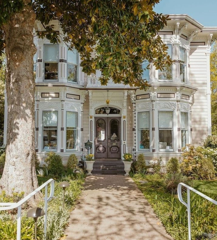
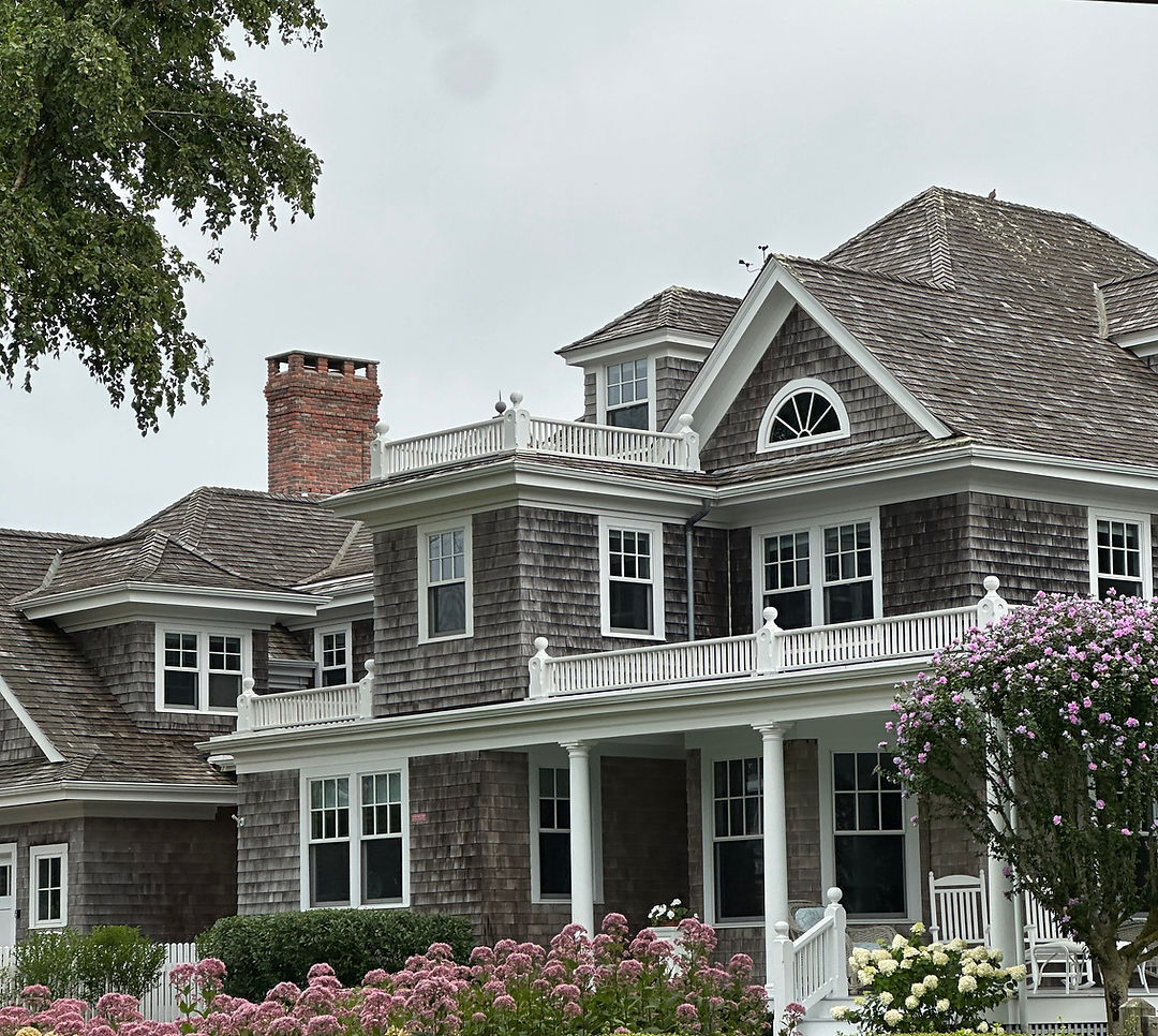
The Dragonfly Inn is a fictional bed and breakfast from Gilmore Girls, reimagined as a real New England inn operating in 2026. The project explores how a familiar fictional brand could evolve into a cohesive, contemporary identity.
Read more
The brand
The project called for a complete redesign of an existing fictional brand, including a new logo, visual identity, and at least five collateral pieces. I chose The Dragonfly Inn because its established personality and strong sense of place offered a more interesting challenge than building a brand from scratch.
The opportunity
The Dragonfly Inn is charming, independently run, and deeply connected to its New England setting. The challenge was to capture that warmth and sense of history without simply recreating the inn as it appeared on screen. Instead, I approached it as a real business that had been operating for more than two decades and naturally evolved its identity over time.
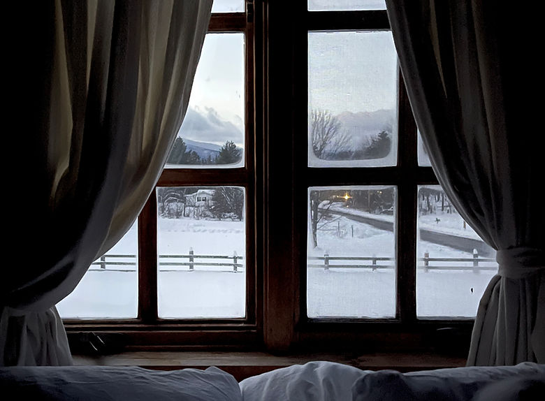
The goal was to create a brand that felt established, regionally specific, and appropriate for a real inn in 2026 — familiar enough to belong in Stars Hollow, but considered enough to exist outside the show.

Building the identity
The project evolved through three versions, with each iteration moving further away from recreating the fictional inn and toward building a believable, fully realized brand.
A refined sense of place
The dragonfly motif remained central throughout, but V3 refined it into a more considered illustration paired with a script wordmark. Deep red, cream, navy, light blue, and brown ground the identity in traditional New England visual culture while giving the brand enough range to work across applications.
a cohesive type system
V1's vaguely medieval display type and mismatched supporting fonts were replaced entirely. The logo script became the primary display typeface, while two complementary sans-serifs create hierarchy across subheadings and body copy. The result feels classic without becoming overly formal.
a new collateral system
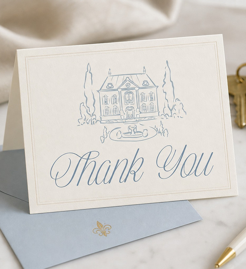
All five collateral pieces were rebuilt from scratch, with hand-drawn illustrations of period New England architecture creating consistency and warmth across the suite. Swans, a recurring detail from the show, appear as a secondary motif on select pieces, while proportion, spacing, and typography remain consistent throughout.

The Outcome
V3 reframed The Dragonfly Inn from a fictional set to a believable business with history, personality, and a visual language of its own. The final identity feels like something an established New England inn could have naturally developed over twenty years.
The biggest shift was not a single design decision, but the way I approached the problem. V1 and V2 were attempts to design the inn as it appeared on screen; V3 was an attempt to design the inn as it would exist in the real world.