Brand Identity Design | 2026
Shebrews
Case Study
Shebrews is a women-owned Christian coffee brand built around a simple idea: coffee can be a reason to gather, but the real product is connection. The project explores how that idea evolved into a visual identity rooted in community, place, and purpose.
Read more

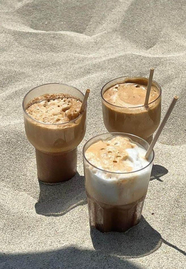
The brand
Shebrews is a women-owned faith-based coffee company based in sunny Southern California. The name is a play on “Hebrews”, and nods to its feminine foundation, “She”. The tagline, “Sip Slow, Stay a While” encapsulates the goal of the branding — Shebrews is more than a coffee shop to pass through, it’s a meeting point, a third space, and a place of connection in a disconnected world.
The opportunity
Young people are increasingly lacking third spaces where they can meet and spend time together without the pressure to constantly spend money. Shebrews was conceived less as a coffee shop to meet at and more as a meeting place with coffee — a space designed around staying, connecting, and belonging.
The challenge was translating that idea into a visual identity that felt distinctly Shebrews: coastal, faith-rooted, intentional, and contemporary without relying on expected Christian or coffee-shop tropes.
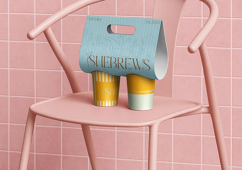

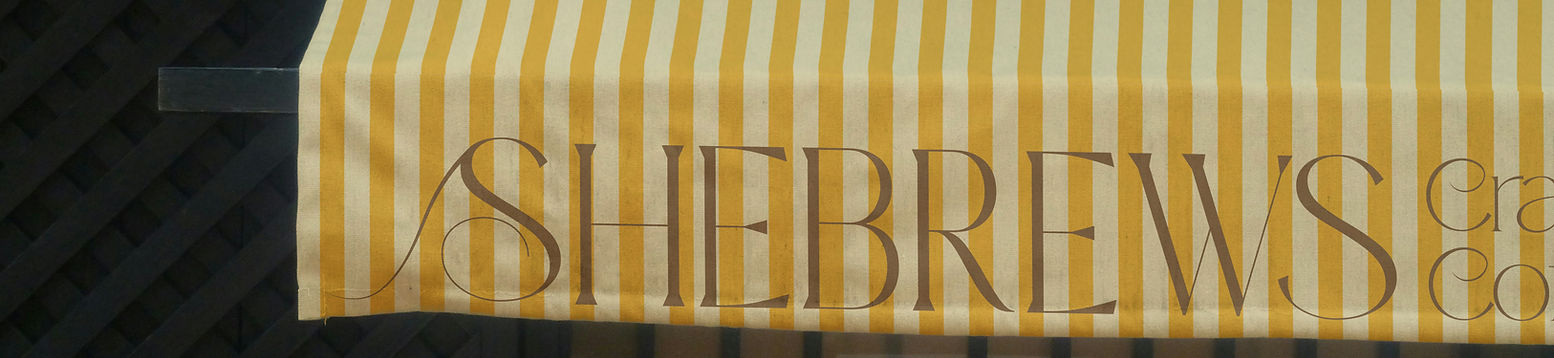
Building the identity
The project evolved through three versions over four years, with each iteration bringing the visual identity closer to the original concept. V3 became the point where strategy, place, and visual expression finally aligned.
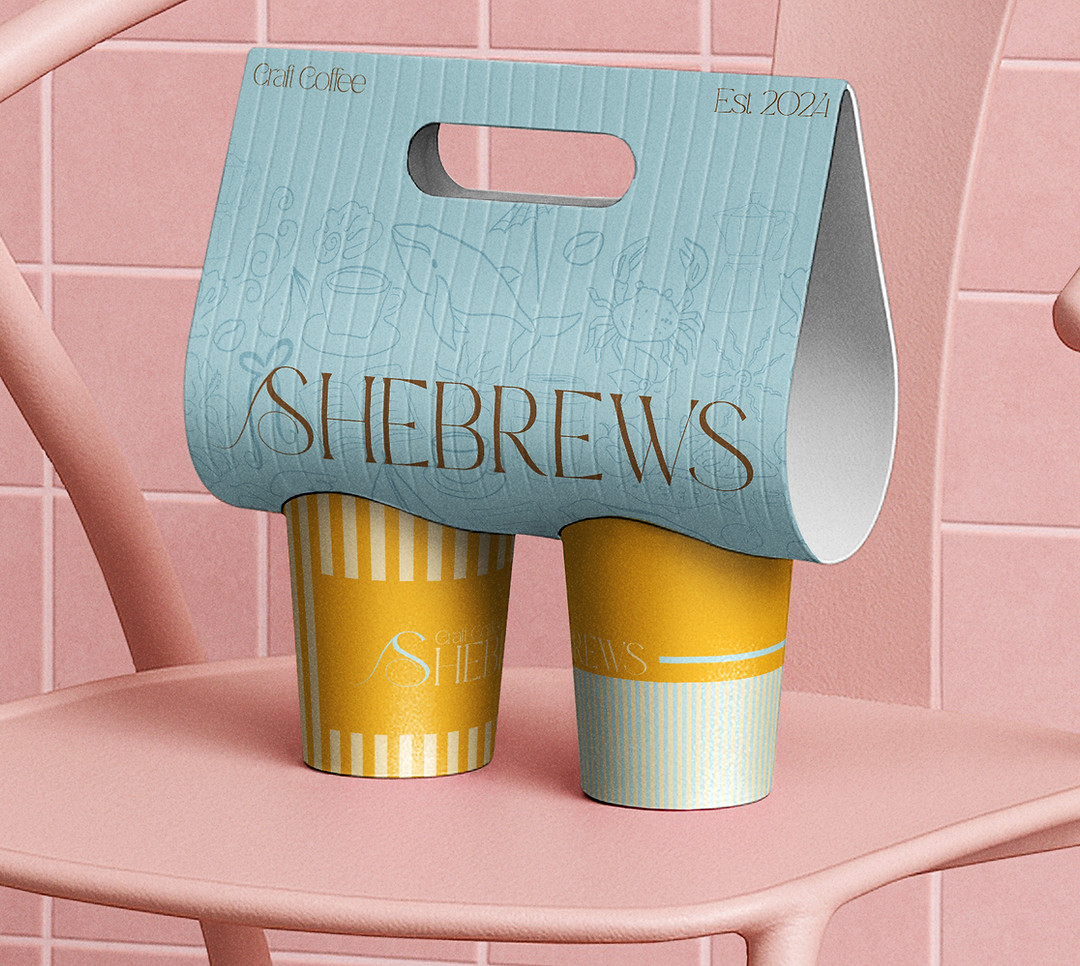
A sense of place
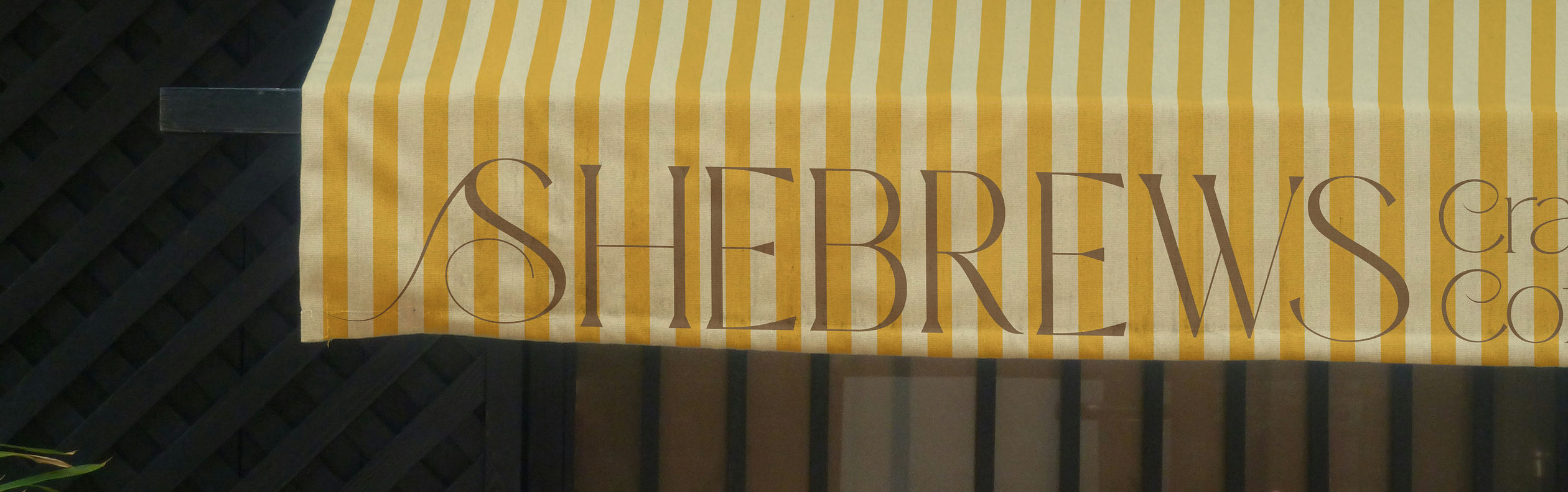
The V3 logo was rebuilt around a wave forming the capital S in the wordmark, making Shebrews’ coastal identity part of the mark itself. The palette — Espresso, Oasis, Sea Salt, Tangerine, and Sand — was inspired by the specific colors of a West Coast coastal environment rather than chosen simply for cohesion.
a cohesive type system
V1 and V2 had strong strategic foundations but lacked a visual system that could fully carry the brand. V3 replaced the original typography with a more intentional combination of typefaces, creating a system that feels contemporary, approachable, and cohesive across applications.
purpose beyond the brand
V3 also formalized Shebrews’ commitment to ocean conservation: 10% of all profits are donated to ocean conservation, and every product or collaboration must be reef-safe and ocean-conscious. That purpose became a filter for the brand, extending beyond messaging into the products and partnerships themselves.
The Outcome
V3 transformed Shebrews from a strong concept with an underdeveloped visual identity into a brand that could communicate its full point of view. The final system brought together faith, community, coastal identity, and environmental responsibility in a way that felt cohesive rather than compartmentalized.
The project ultimately taught me that a good concept only gets you so far. V1 and V2 had the right idea — V3 is where the design finally caught up to it.