Bone Broth
This is a project description
Client:
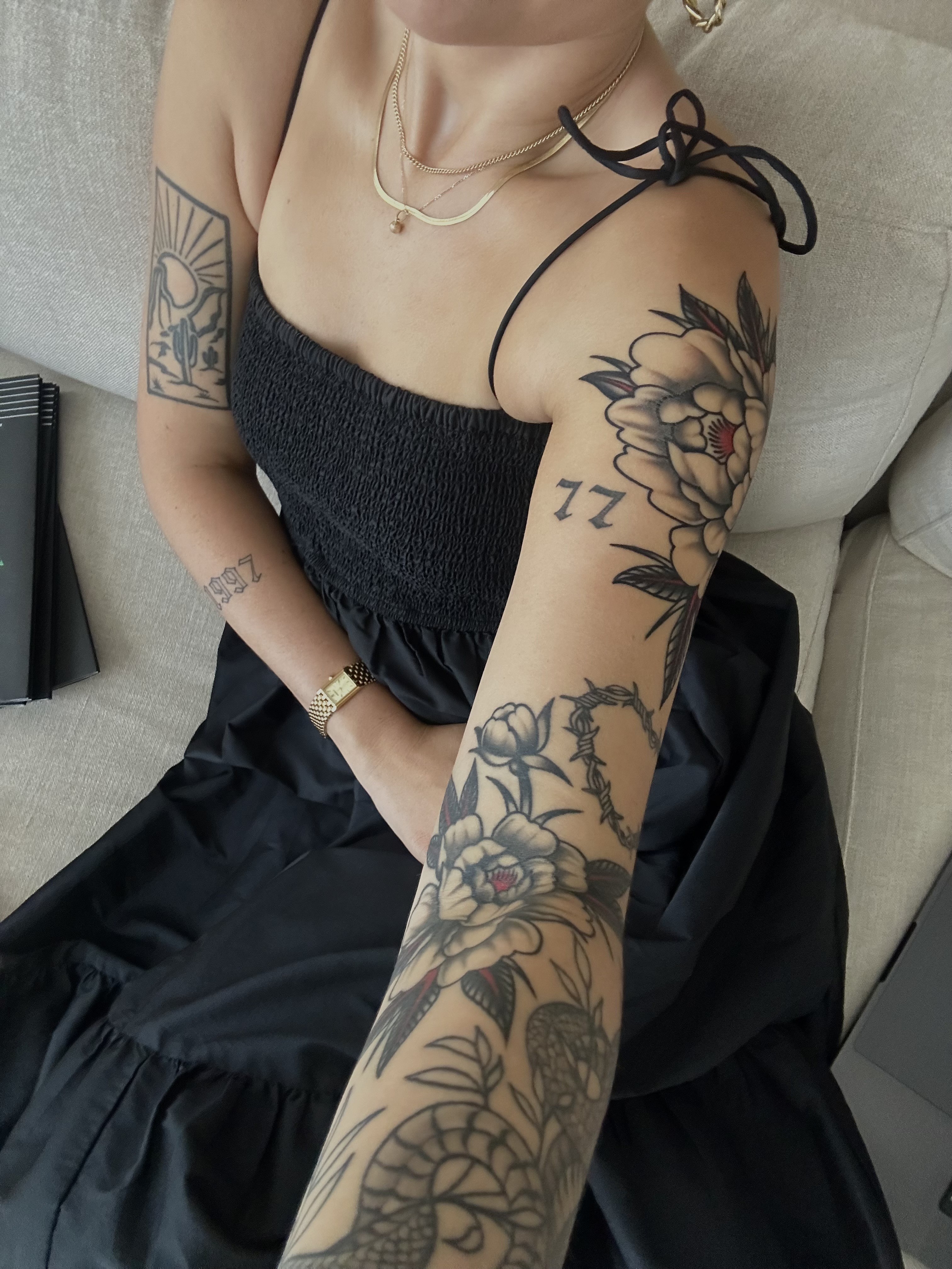
Bone Broth — Private Tattoo Artist
Category:
Brand Identity Design
My Role:
Graphic Designer — Solo
I am an expert in creating unique and immersive micro environments that give your space a special touch.
Ultrices lobortis varius elit dolor turpis venenatis. In etiam lacus tellus eget. Massa vitae pellentesque proin non malesuada. Non gravida id eu mi sed tristique felis lobortis rutrum. Eu sed leo non porttitor lacus. Ut vel et auctor eu lacus, egestas. Velit amet adipiscing porttitor nunc, neque tristique.
Tristique luctus amet commodo lobortis ut tellus mauris, purus dictumst. Tincidunt diam aenean commodo odio cras augue a donec eget. Posuere interdum neque morbi nec ut enim ipsum lacus, aliquam.

What we do in this project.
Ultrices lobortis varius elit dolor turpis venenatis. In etiam lacus tellus eget. Massa vitae pellentesque proin non malesuada. Non gravida id eu mi sed tristique felis lobortis rutrum. Eu sed leo non porttitor lacus. Ut vel et auctor eu lacus, egestas in eu. Velit amet adipiscing porttitor nunc, neque tristique. Ornare amet, gravida tellus nisl.
Morbi leo risus, porta ac consectetur ac, vestibulum at eros. Donec sed odio dui. Nullam id dolor id nibh ultricies vehicula ut id elit. Nulla vitae elit libero pharetra augue.
Building the identity
The V3 logo was rebuilt around a wave forming the capital S in the wordmark, making Shebrews’ coastal identity part of the mark itself. The palette — Espresso, Oasis, Sea Salt, Tangerine, and Sand — was inspired by the specific colors of a West Coast coastal environment rather than chosen simply for cohesion.
V1 and V2 had strong strategic foundations but lacked a visual system that could fully carry the brand. V3 replaced the original typography with a more intentional combination of typefaces, creating a system that feels contemporary, approachable, and cohesive across applications.
V3 also formalized Shebrews’ commitment to ocean conservation: 10% of all profits are donated to ocean conservation, and every product or collaboration must be reef-safe and ocean-conscious. That purpose became a filter for the brand, extending beyond messaging into the products and partnerships themselves.

The Outcome
V3 transformed Shebrews from a strong concept with an underdeveloped visual identity into a brand that could communicate its full point of view. The final system brought together faith, community, coastal identity, and environmental responsibility in a way that felt cohesive rather than compartmentalized.
The project ultimately taught me that a good concept only gets you so far. V1 and V2 had the right idea — V3 is where the design finally caught up to it.
Related Projects

